Everything you need, end to end.
A logo is the smallest, most-repeated piece of your brand. Here is what you actually receive.
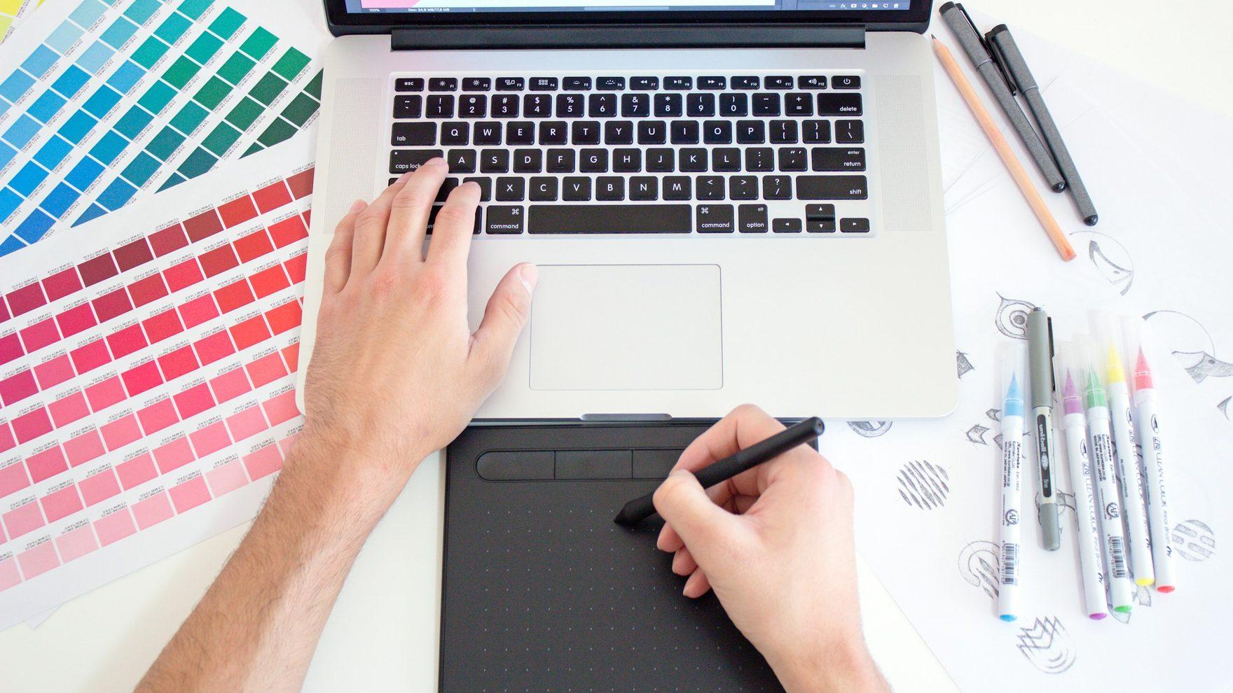
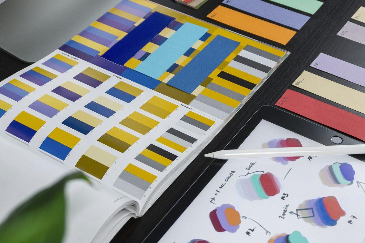
Photography here illustrates the settings this work runs in. The interfaces shown are representative — yours is designed around your brand and your data.
Original marks, never stock icons
Each direction is drawn from scratch around what your business stands for, and comes with the thinking behind it. You choose a mark with a reason, not a shape you liked on a marketplace.
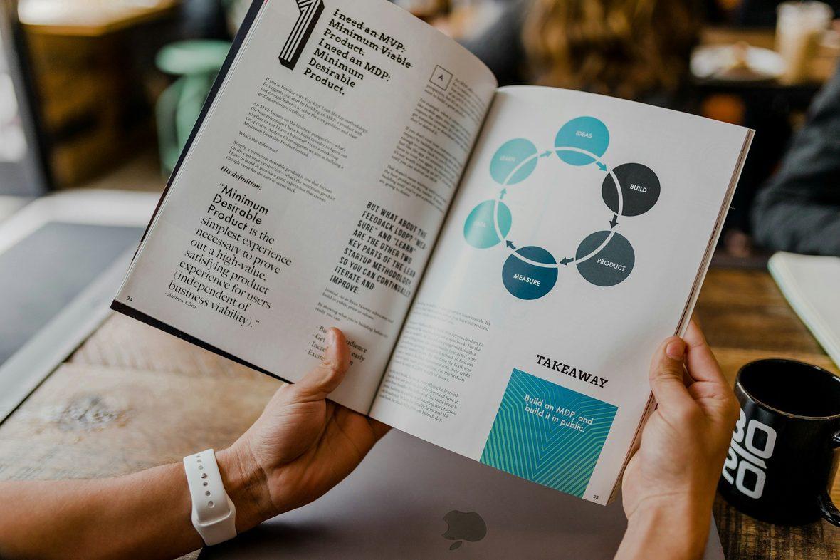
A complete brand board, not one file
The mark you pick ships as a full system — horizontal and stacked lockups, light and dark, favicon, colour tokens, type scale and spacing rules — so your brand holds up on a business card and a billboard alike.
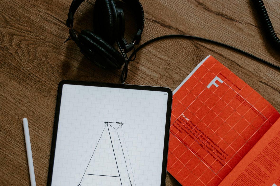
Tested at the sizes it will really run
We prove the mark at browser-tab size, on signage, embroidered, and reversed out of a photo before we hand it over — because a logo that only works on a presentation slide is not finished.
Real logos, at full strength.
Not screenshots of a website — the marks themselves, the way they leave our studio.
What people come to us for.
SaaS brand identity
A wordmark + monogram system for a B2B platform, tuned to read cleanly at 16px in a browser tab and on a conference banner.
Local-business rebrand
Refreshed an aging logo into a modern, flexible mark with a complete style guide for signage, packaging and social.